
![[Audio Only] IC94 Keynote 03 - OUT OF MY MIND AND YOURS - Bernie Siegel](https://intellschool.info/wp-content/uploads/2022/02/MrI_A_JRMkeje763RUZqjg-200.jpg)


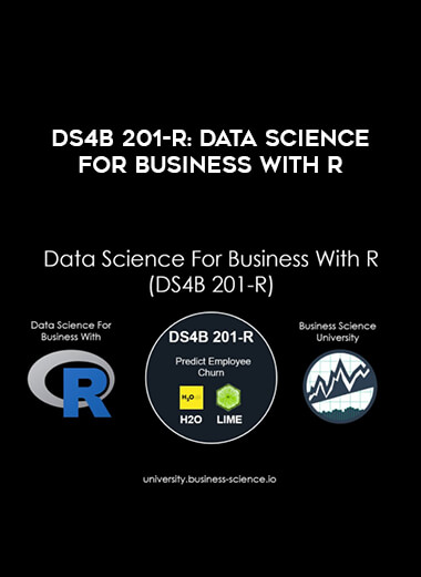
DS4B 201-R: Data Science For Business With R
 Salepage : DS4B 201-R: Data Science For Business With R
Arichive : DS4B 201-R: Data Science For Business With R
Solve a real-world churn problem with H2O AutoML (automated machine learning) & LIME black-box model explanations using R
DS4B 201-R teaches you the tools and frameworks for ROI-driven data science using the R-programming language.
Over the course of 10-weeks you’ll dive in-depth into an Employee Attrition (Churn) problem, learning & applying a systematic process, cutting-edge tools, and R code.
At the end of the course, you’ll be able to confidently apply data science within a business.
The difference with the DS4B 201-R program: You get results!
Who Is This Program For?
We have hundreds of data scientists in the course. Mainly they fall into 3 categories:
Data Scientists In Business: Data scientists seeking to make the link between data science and the business objectives while driving ROI for their organization.
Consultants: Data scientists working for companies in large consulting firms (e.g. Accenture, Deloitte, etc) and boutique consulting firms that are related to enterprise improvement and ROI.
Students: Future data scientists seeking to gain skills beyond their current program offering. Leveraging Business Science University gets you trained on high-demand skills placing you ahead of your peers in the job market.
The course takes about 10 weeks to complete. It’s an in-depth study of one churn / binary classification problem that goes into every facet of how to solve it. Here’s the basic structure of DS4B 201-R.
Week 1: Getting Started
You begin with the problem overview and tool introduction covering how employee churn effects the organization, our toolbox to combat the problem, and code setup.
We introduce the Business Science Problem Framework, which is our step-by-step roadmap for data science project success.
The BSPF is used as guide as you progress through each chapter in the course.
Week 2: Business Understanding
You progress into sizing the problem.
You develop skills with dplyr and ggplot2, critical to exploring data. You are introduced to a new metaprogramming language called Tidy Eval for programming with dplyr.
You use Tidy Eval for the attrition code workflow, building a customizable plotting function to show executives which departments and job roles are costing the organization the most due to attrition.
Week 3: Data Understanding
The goal is to not waste time. You’ll learn two critical packages for exploring data and uncovering insights quickly.
First, you’ll investigate data by data type using the skimr package. You investigate continuous (numeric) and categorical (factor) data.
Next, you’ll investigate data relationships visually using GGally. You uncover key relationships between the target variable (attrition) and the features (e.g. tenure, pay, etc).
Week 4: Data Preparation
Next, you prepare the data for both humans and machines with the goal of making sure you have good features prior to moving into modeling. Again, the goal is to not waste time until we have fully understood the problem and have good features.
First, you use the tidyverse packages to wrangle data into a format that is readable by humans, creating a “human readable” processing pipeline.
Next, you use the recipes package to create a “machine readable” processing pipeline that is used to create a pre-modeling correlation analysis visualization.
The correlation analysis confirms we have good features and can proceed to modeling.
Weeks 5 & 6: H2O Modeling & Performance Analysis
Next, you learn H2O, a high performance modeling package. You spend two chapters with H2O.
In Chapter 4 (modeling), you learn the primary H2O functions for automated machine learning. You generate models including:
Generalized Linear Models (GLM)
Gradient Boosted Machines (GBM)
Random Forest (RF)
Deep Learning (DL)
Stacked Ensembles.
You create a visualization that examines the 30+ models you build.
In Chapter 5 (performance), you go in-depth into performance analysis. You learn about ROC Plot, Precision vs Recall, Gain & Lift Plots (which are for executive communication). You build the “ultimate model performance dashboard”.
Week 7: Explaining Black-Box Models
“The business won’t care how high your AUC is if you can’t explain your Machine Learning models. Explain those models.”
-Matt Dancho, Founder of Business Science
Now, you learn about LIME and how to perform local machine learning interpretability to explain complex models, showing which features contribute to attrition on a localized, employee level.
You’ll also have a cool challenge where you recreate the plots with a business-ready theme .
Weeks 8 & 9: Expected Value, Threshold Optimization, & Sensitivity Analysis
Now it’s time to link Machine Learning to Expected Financial Performance. You spend two chapters with on expected value, threshold optimization, and sensitivity analysis.
We start with a basic case of making a “No Overtime” policy change. We then go through Expected Value Framework, a tool that enables targeting high-risk churners and accounts costs associated with false negatives / false positives.
We then teach how to optimize the threshold using purrr for iteration to maximize expected savings of a targeted policy. We then teach you Sensitivity Analysis again using purrr to show a heatmap that covers confidence ranges that you can explain to executives.
Week 10: Recommendation Algorithm Development
“To make progress, you need to make good decisions. Good decisions are systematic and data-driven.”
-Matt Dancho, Founder of Business Science
This is the culmination of your hard work. It’s time to apply critical thinking skills by developing a data-driven recommendation algorithm from scratch.
You will follow a 3-Step Process that shows you how to build a recommendation algorithm for any business problem.


Reviews
There are no reviews yet.